لكل فنان رؤية خاصة و كل رؤية تستقى ربما من مواد معينة تحلق بخيالنا للبعيد
هنا مطرح لرؤى محتملة :
هنا مطرح لرؤى محتملة :

| At first glance, the individual pieces in Marchesa's fall/winter 2008 collection felt overtly feminine, often bordering on frilly. But, when studied as a whole, the complex detailing and pronounced structure of the collection reminded me of tapering spires and tiered pagodas found on temples and sanctuaries. (I was also reminded of their decorated finials, the highest point of the spire or pagoda which serves to protect it from lightning.) Symbolically, spires and pagodas have two functions. The first is to give the impression of strength. The second is to reach up toward the skies, bringing one closer to divinity. So, it was no surprise to find out that each piece paid subtle tribute to Queen Elizabeth I, who was forced to keep her femininity hidden despite her awesome power. According to Nicole Phelps of style.com, "There was a new structure to these clothes. Take the stunning black dress with an hourglass shape so sculpturally defiant, it evoked armor. Anybody who wore it would be paparazzi-proof." |
Marchesa
by ; Keren Craig and Georgina Chapman
fall/winter 2008
by ; Keren Craig and Georgina Chapman
fall/winter 2008
أبراج الباغودا* المقدسة


| Only Karl Lagerfeld (in all his ooey-gooey goodness) could pull off an entirely white couture collection. And that's exactly what he did on the Chanel Spring '09 runway. Despite mixed reactions to the stark white motif, giant paper flowers, and white laser-cut details, Karl simply shrugged it off as "[starting] with a clean sheet of paper" (which in fashion is code for "I'm the only bitch on the block that could pull off a stunt like this). But, even in all it's washed-out minimalism, the devil was in the details. Every ruffled edge, lacy trim, and braided accent had me hearing wedding bells ringing in the distance. After all, what's more exquisitely detailed in all it's white glory than a towering wedding cake, complete with a floral topper? (Marie Antoinette -- eat your heart out!) |
CHANEL
by ;Karl Lagerfeld
Spring '09 collection
by ;Karl Lagerfeld
Spring '09 collection
رداً على ماري انتوانيت " ليأكلوا الكعك إذاً "
 اقتباس:
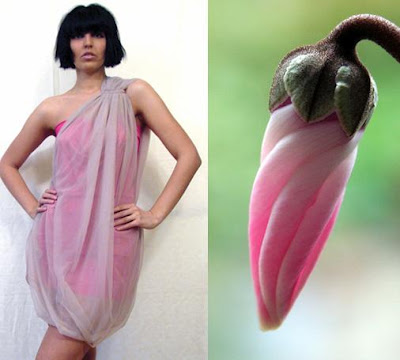
Diana Bobar Spring’08 ready-to-wear collection رقة وردة السيكلامين | |||
| | | | |

| According to John Galliano, his inspiration for the Christian Dior fall/winter 2008 collection was the optimism and opulence of the sixties, amped up with bright color, lashings of paillette embroidery, and Western hats. Sarah Mower at style.com described the collection as "neat ladylike suits and dresses beloved of Kennedy-era America" (not surprising given the back-combed hairdos and thick black eye-makeup.) But, if you take a closer look, his color palette, pattern choices, and cuts bore a striking resemblance to exotic orchids. More 'fantasy flora' than 'First Lady chic |
Christian Dior
by ; John Galliano
fall/winter 2008
وردة الأوركيد
by ; John Galliano
fall/winter 2008
وردة الأوركيد

When Russian-born artist Wladimir Baranoff-Rossiné (1888-1944) set out to perfect Cubo-Futurism (which combines the Cubist usage of forms with the Futurist interest in dynamism), he probably never imagined his creations would find themselves gliding down a London catwalk. Then again, maybe he did. Cubo-Futurism places more emphasis on movement and action then it's predecessor French Cubism (which gives it a perfect segway into fashion). And, while Basso & Brooke claim that an "exploration of Louis XIV's baroque and rococo" was the inspiration behind their Fall 2009 collection, it doesn't take a rocket scientist to see that they lifted their prints and color palettes directly from Wladimir's timeless masterpieces. |
Basso & Brooke
Fall 2009
أطياف" التكعيبيه المستقبليه " في لوحات الرسام Waldimir Rossine
Fall 2009
أطياف" التكعيبيه المستقبليه " في لوحات الرسام Waldimir Rossine


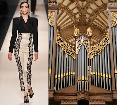
While models in Jean Paul Gaultier's Spring 2009 couture collection waltzed down the runway, an image of a pen-and-ink going through strange computer-generated distortions played in the background. Not surprisingly, his inspiration lay in the age old art of calligraphy (abstract, of course, with loops and swooshes morphing into hard lines and crested edges). However, on second glance, each piece in the collection looked more like a guided walking tour of Wells Cathedral, the most poetic of the English cathedrals (known for its early Gothic interior and signature 'scissor arches.') Perhaps its just wishful thinking on my part, but one would be hard pressed to dismiss the abundance of similarities. |
Jean Paul Gaultier
Spring 2009 couture collection
كاثدرائيات و معابد . .
Spring 2009 couture collection
كاثدرائيات و معابد . .
| |


ليست هناك تعليقات:
إرسال تعليق